The idea
ORYN is the motherbrand. It designs how people and technology meet and connect, so technology strengthens human potential instead of replacing it. Connection is a designed system.
Low contrast for text
* Conceptual work
Bringing people and technology closer together.
* Conceptual work
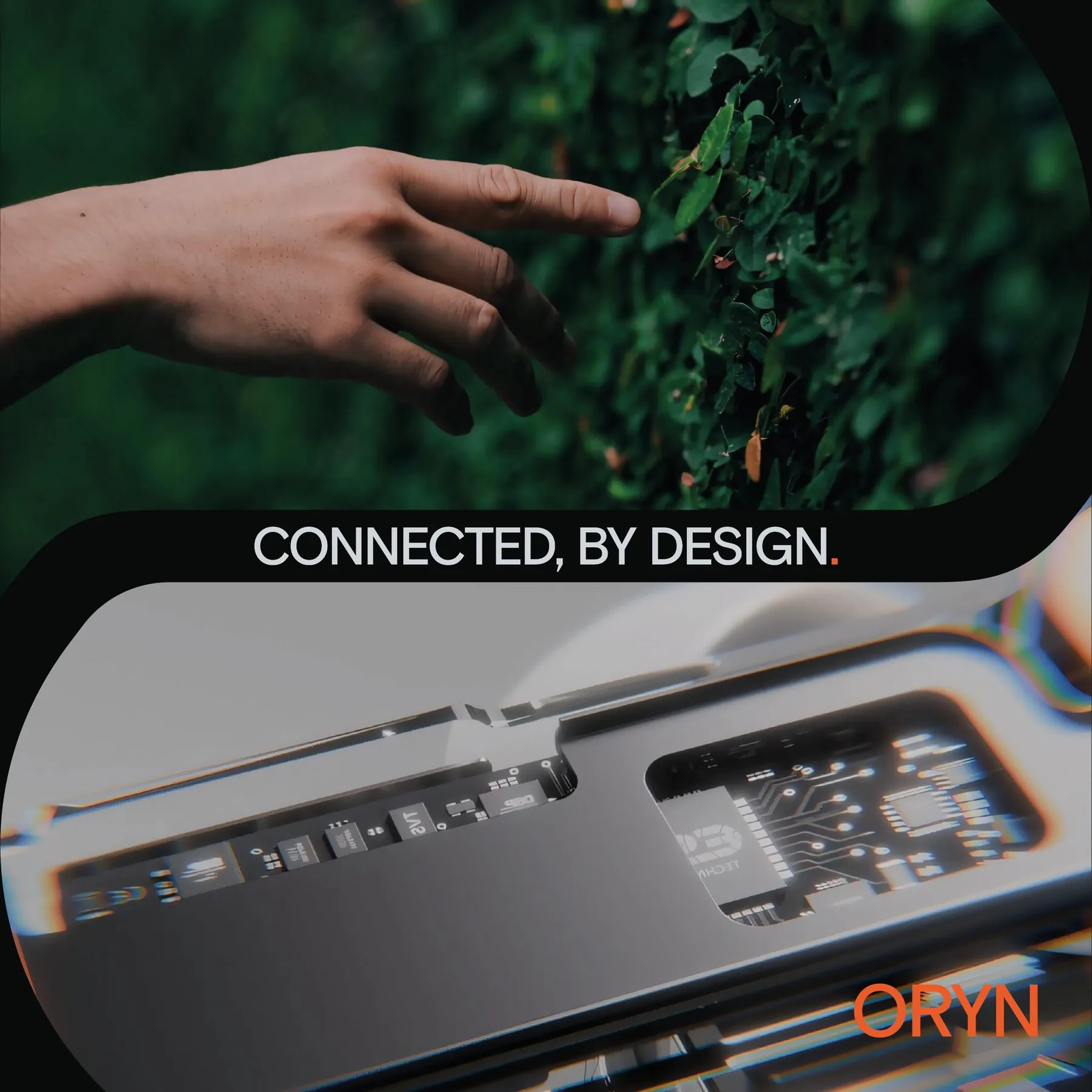
ORYN is the motherbrand. It designs how people and technology meet and connect, so technology strengthens human potential instead of replacing it. Connection is a designed system.
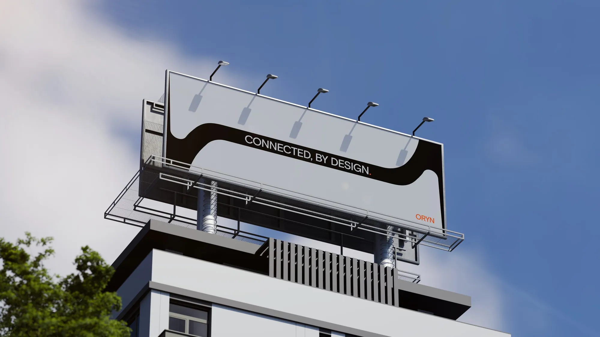
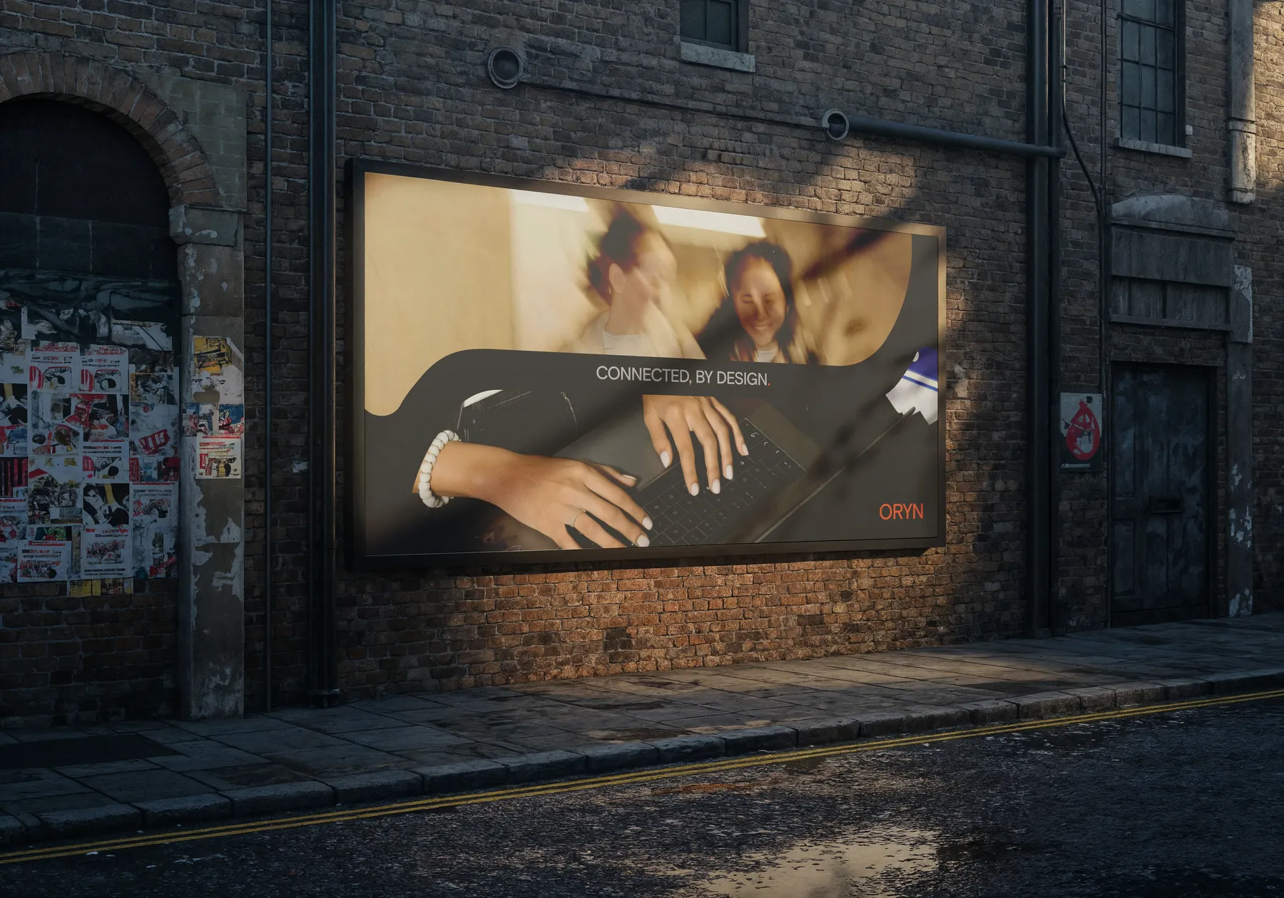
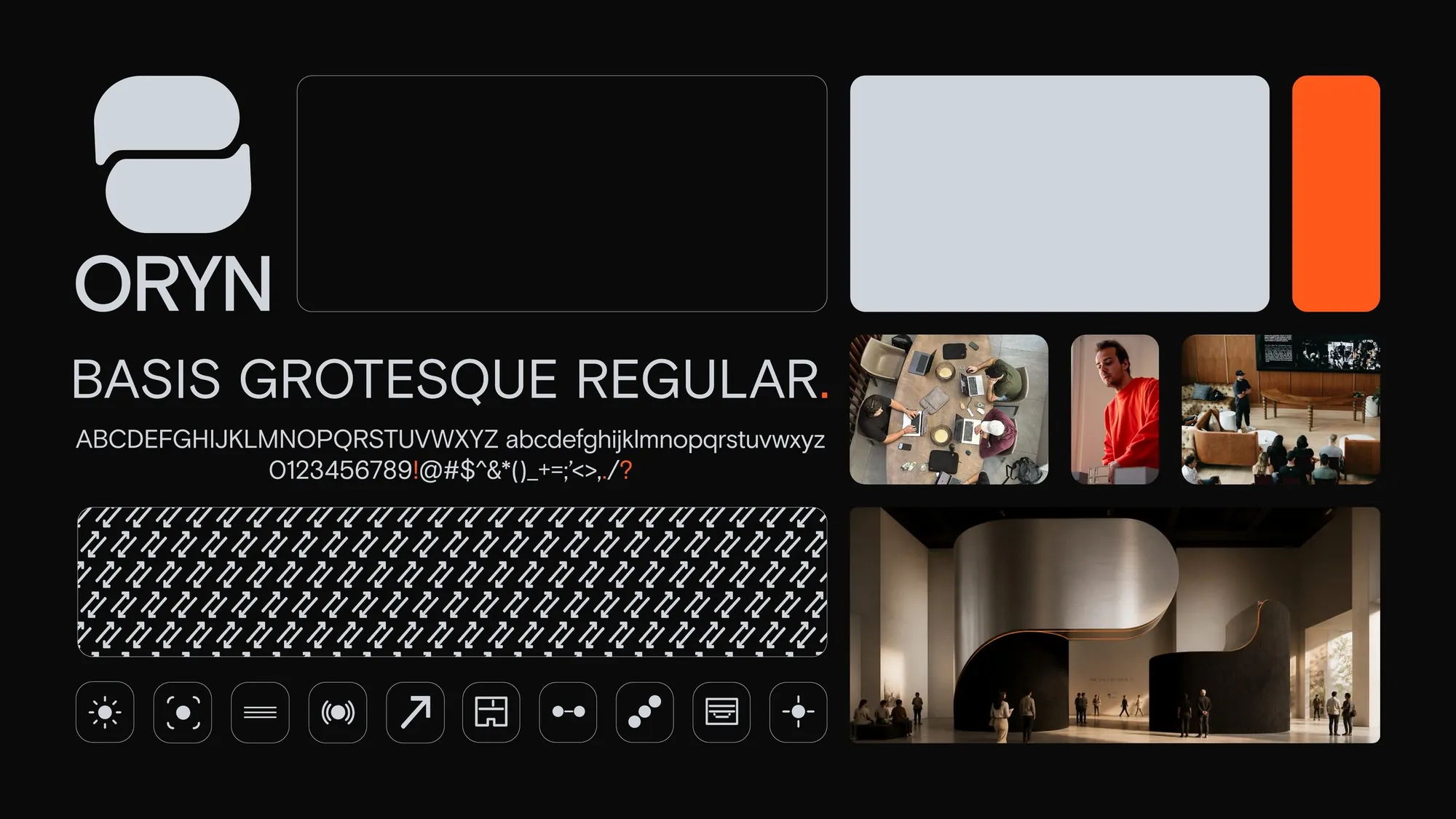
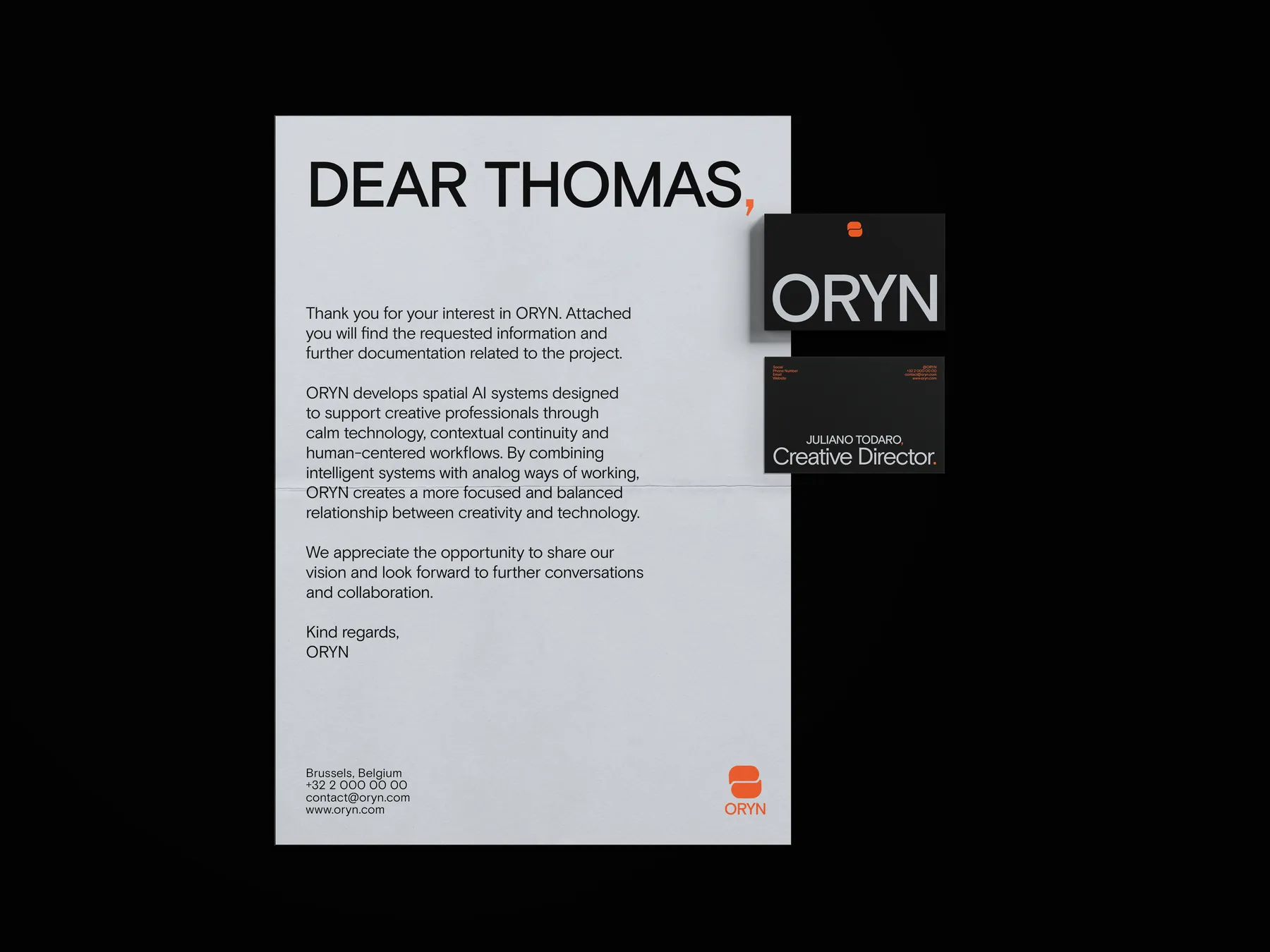
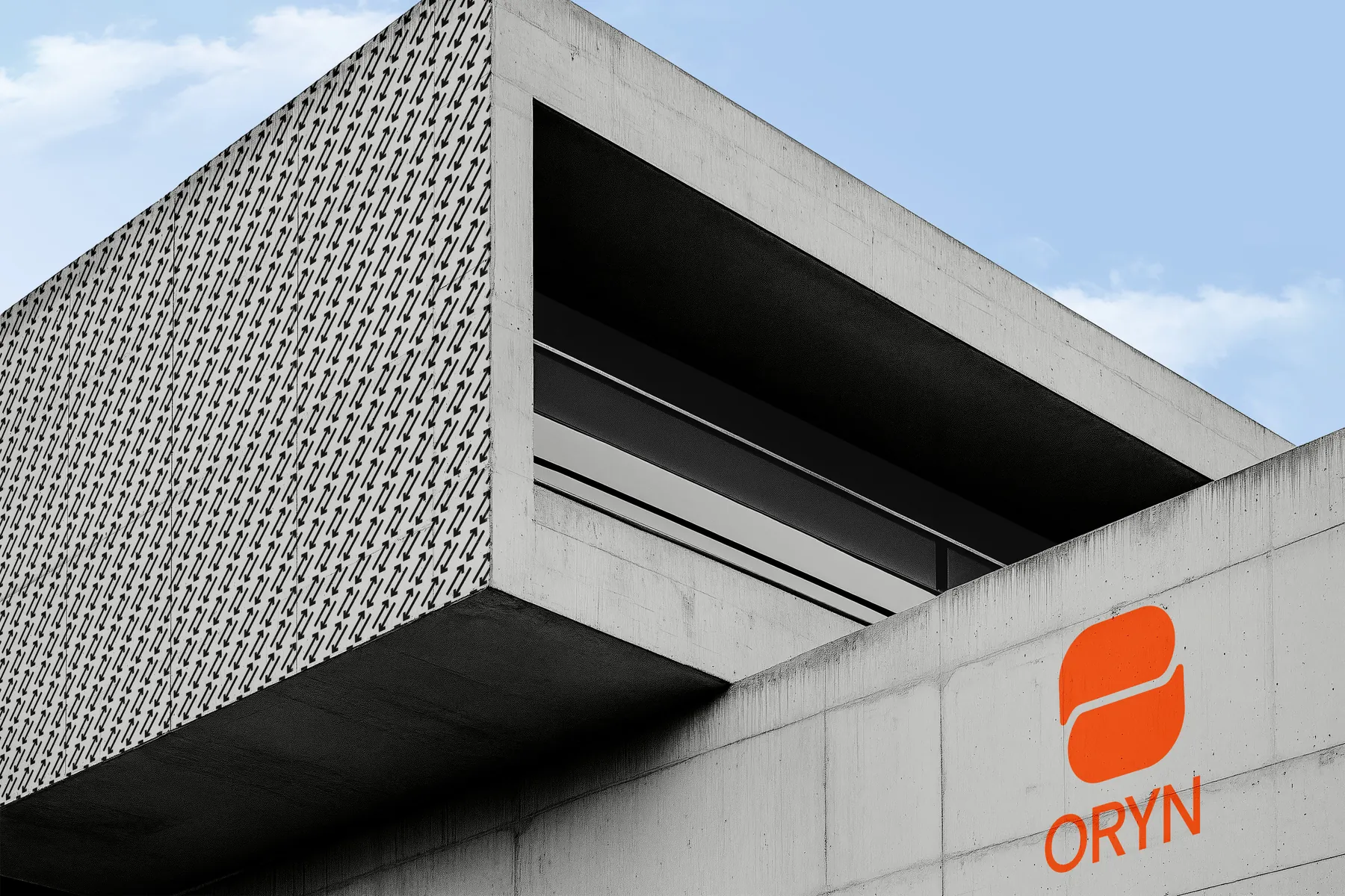
A stacked two-bubble mark in Deep Black, Aluminium and Warm Orange, set in Basis Grotesque.
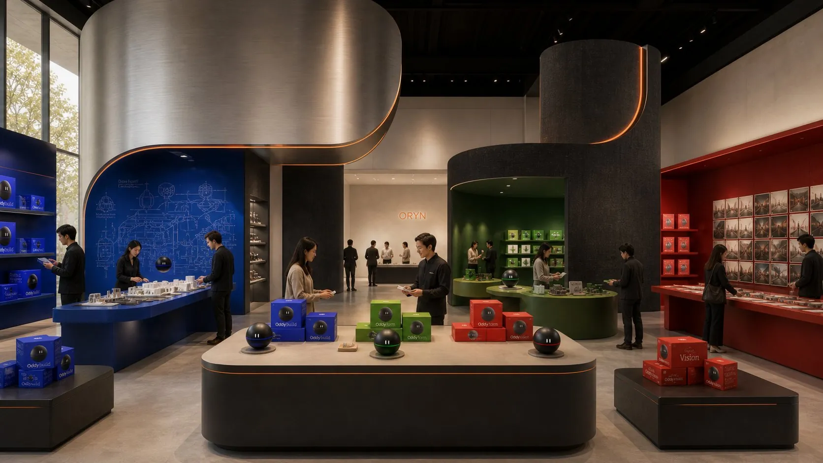
Oddy gives ORYN its personality. The three sub-brands are three orbs, one for each discipline, each with its own colour and character.
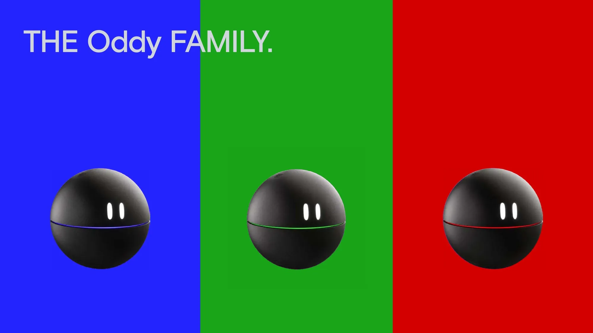
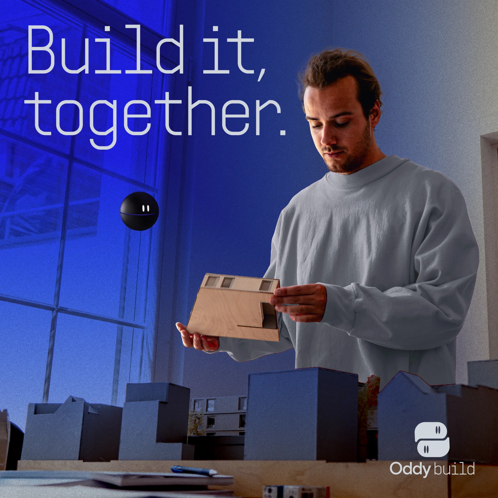
The orb for architects. Personality: precise, calm and structured. Projects, files, scans, plans and models stay connected to the decisions that shaped them.
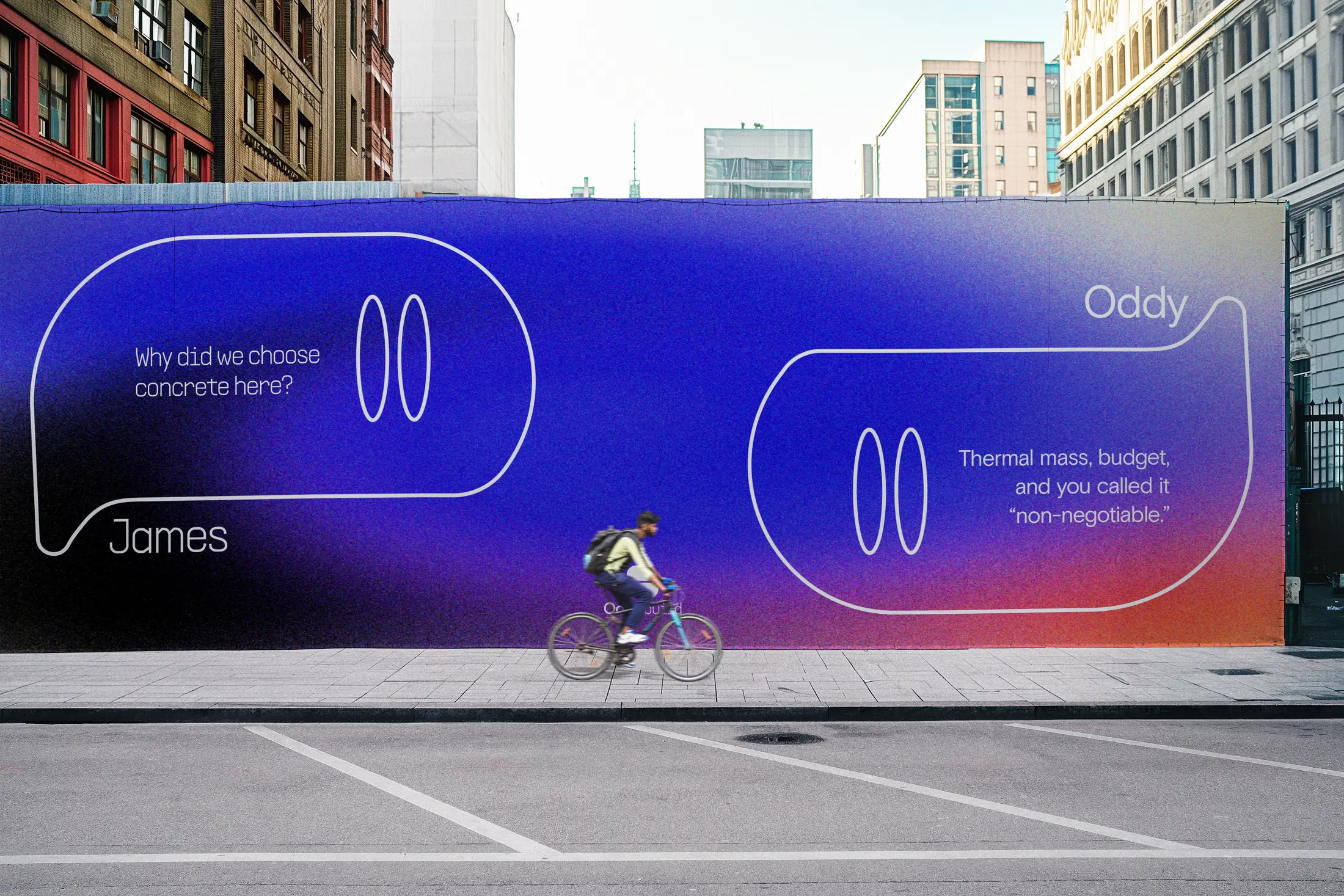
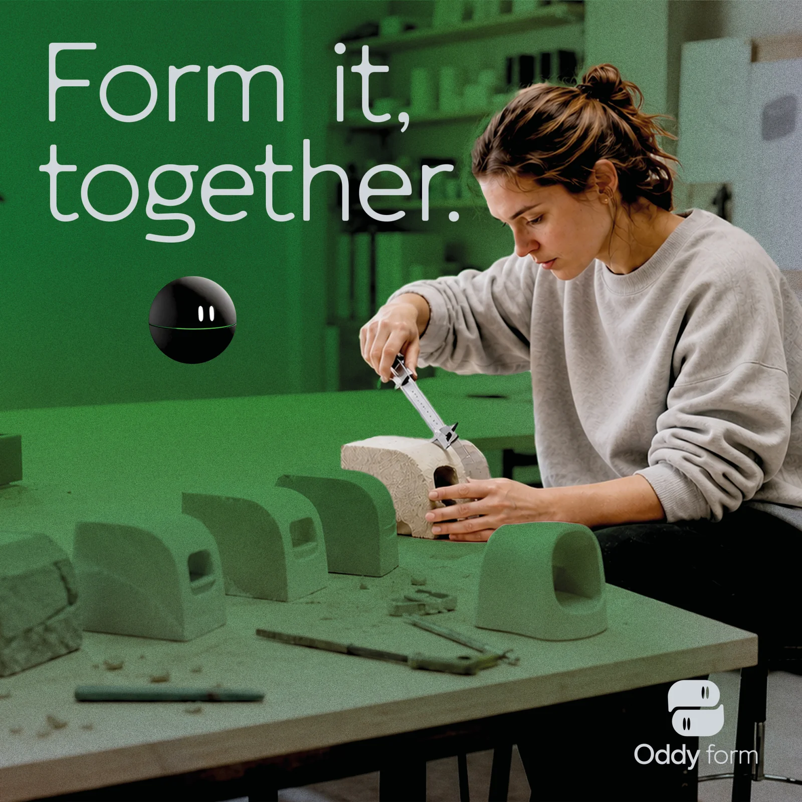
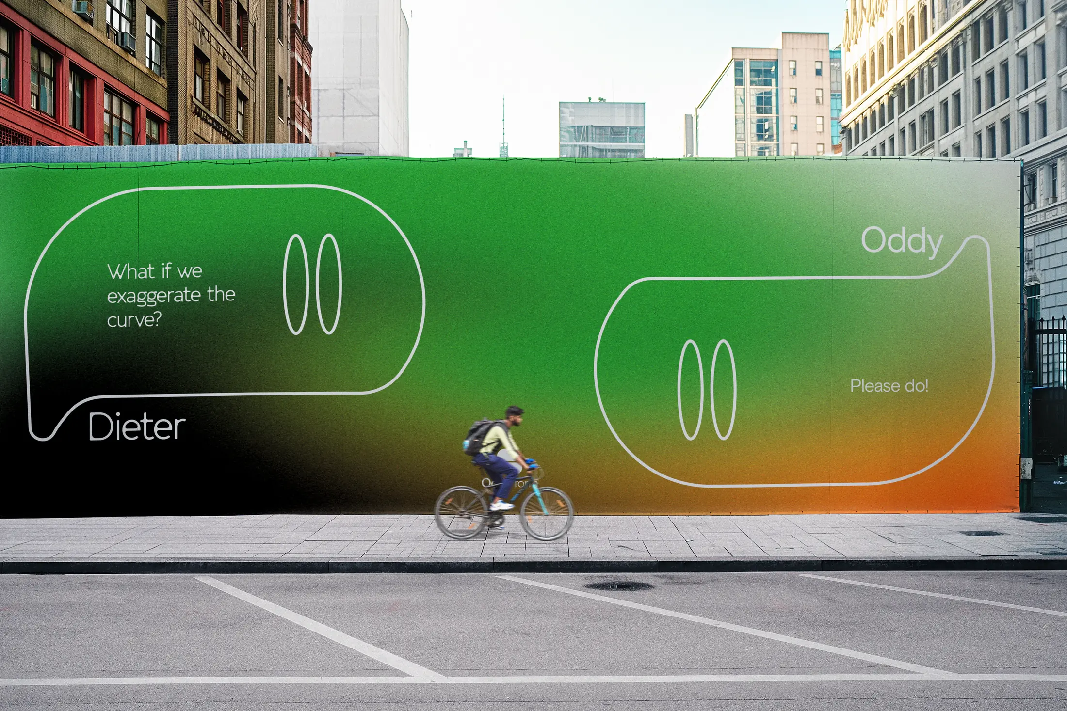
The orb for product designers. Personality: curious, energetic and tactile. Materials, prototypes and iterations become a shared, remembered design process.
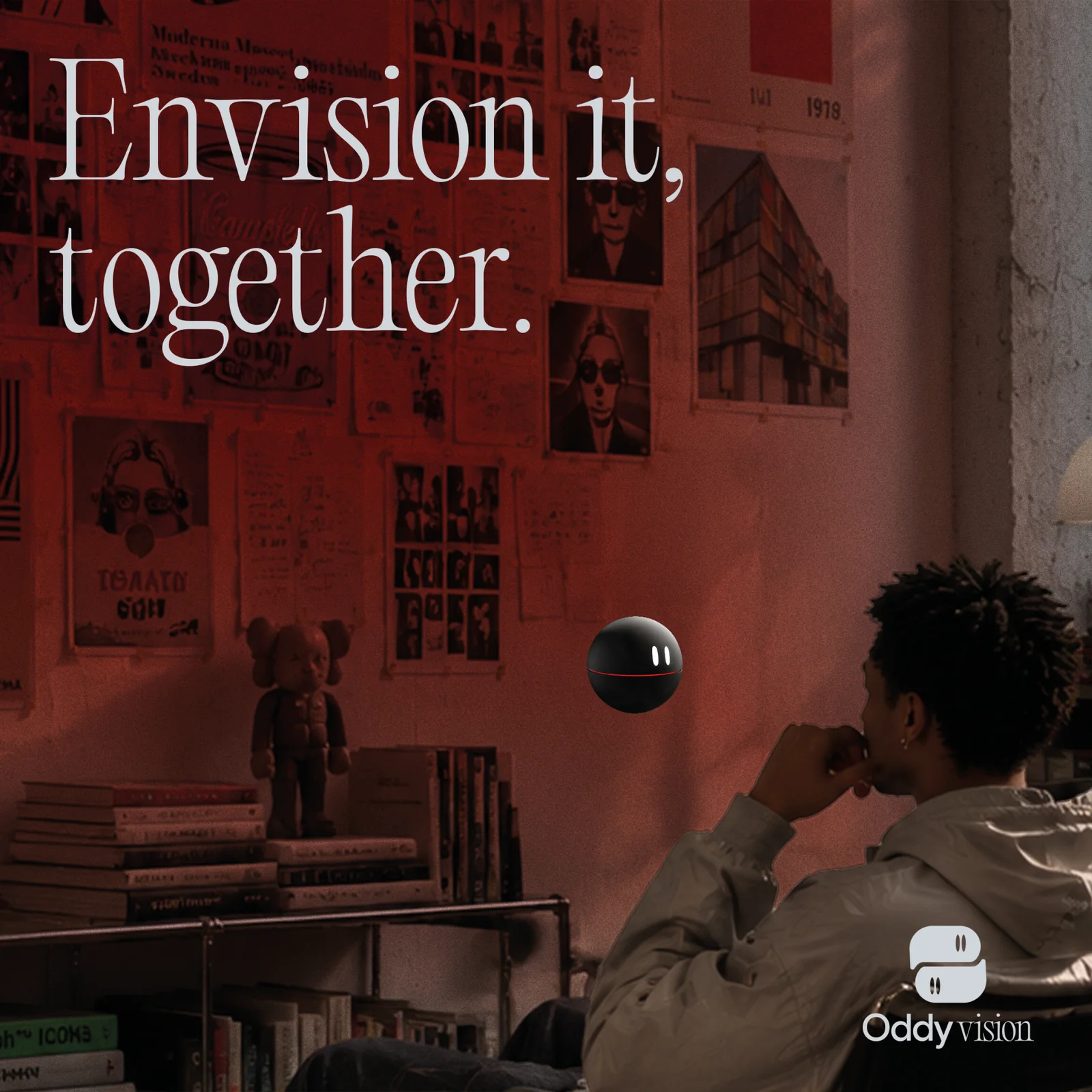
The orb for creative directors. Personality: provocative, expressive and conceptual. References, samples, silhouettes and narratives stay connected to the evolving vision.
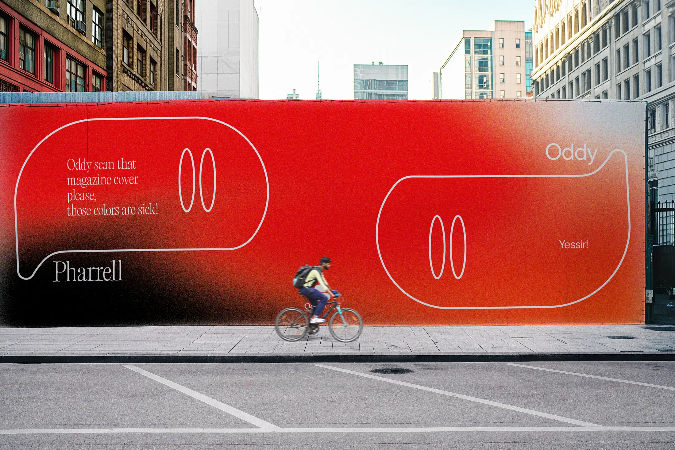
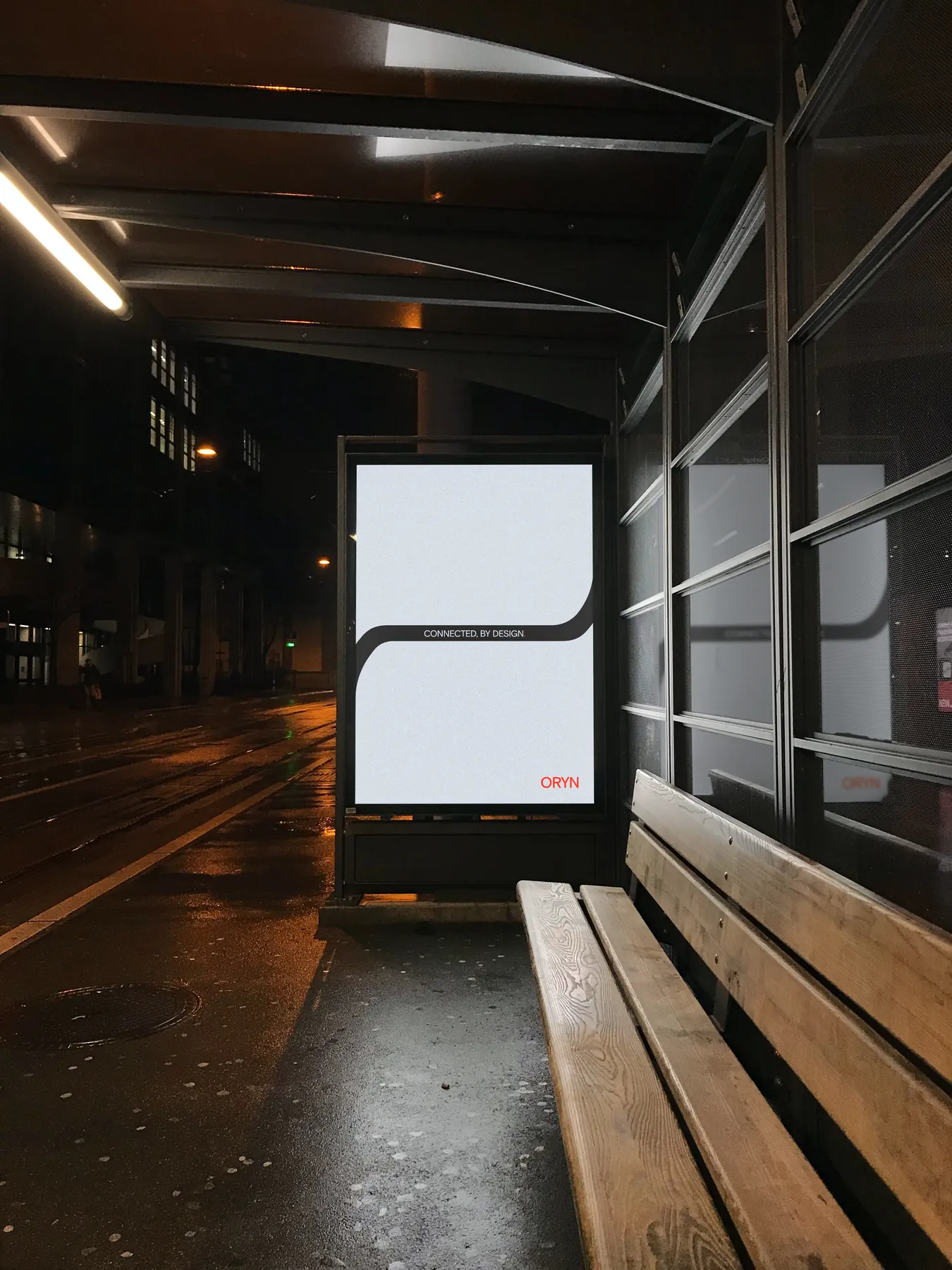
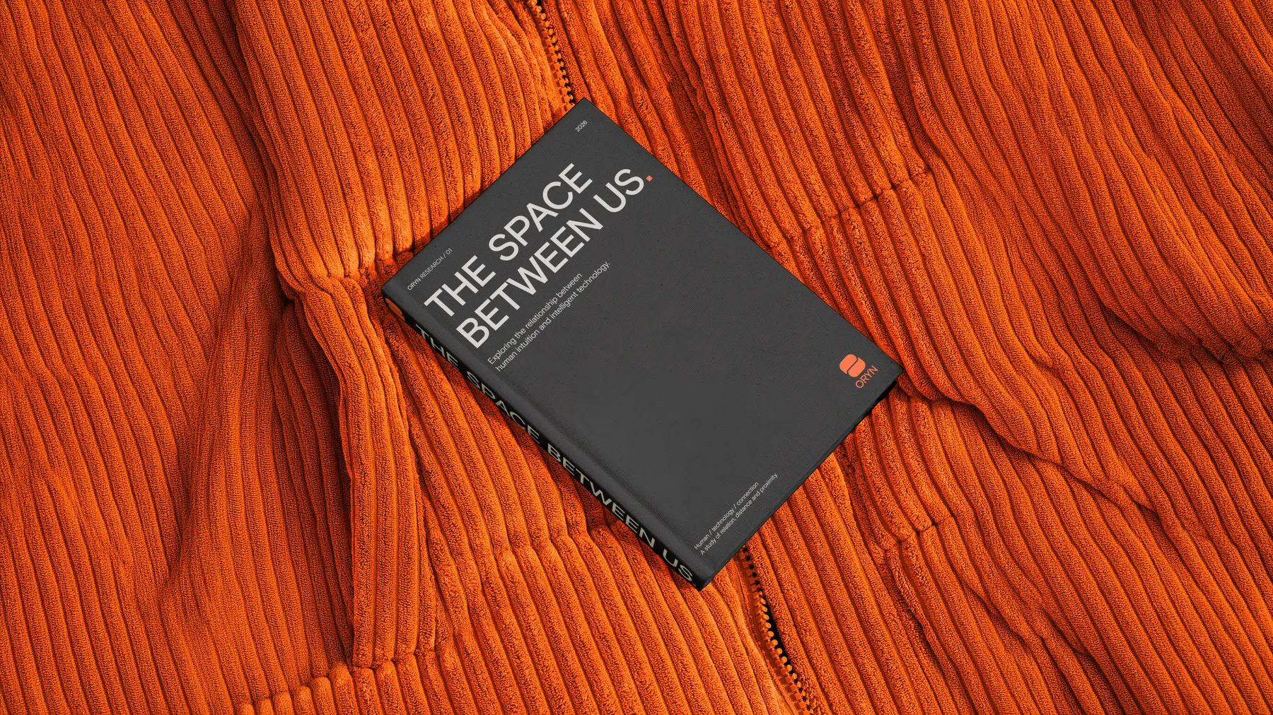
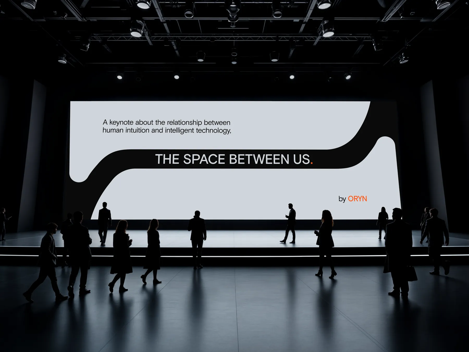
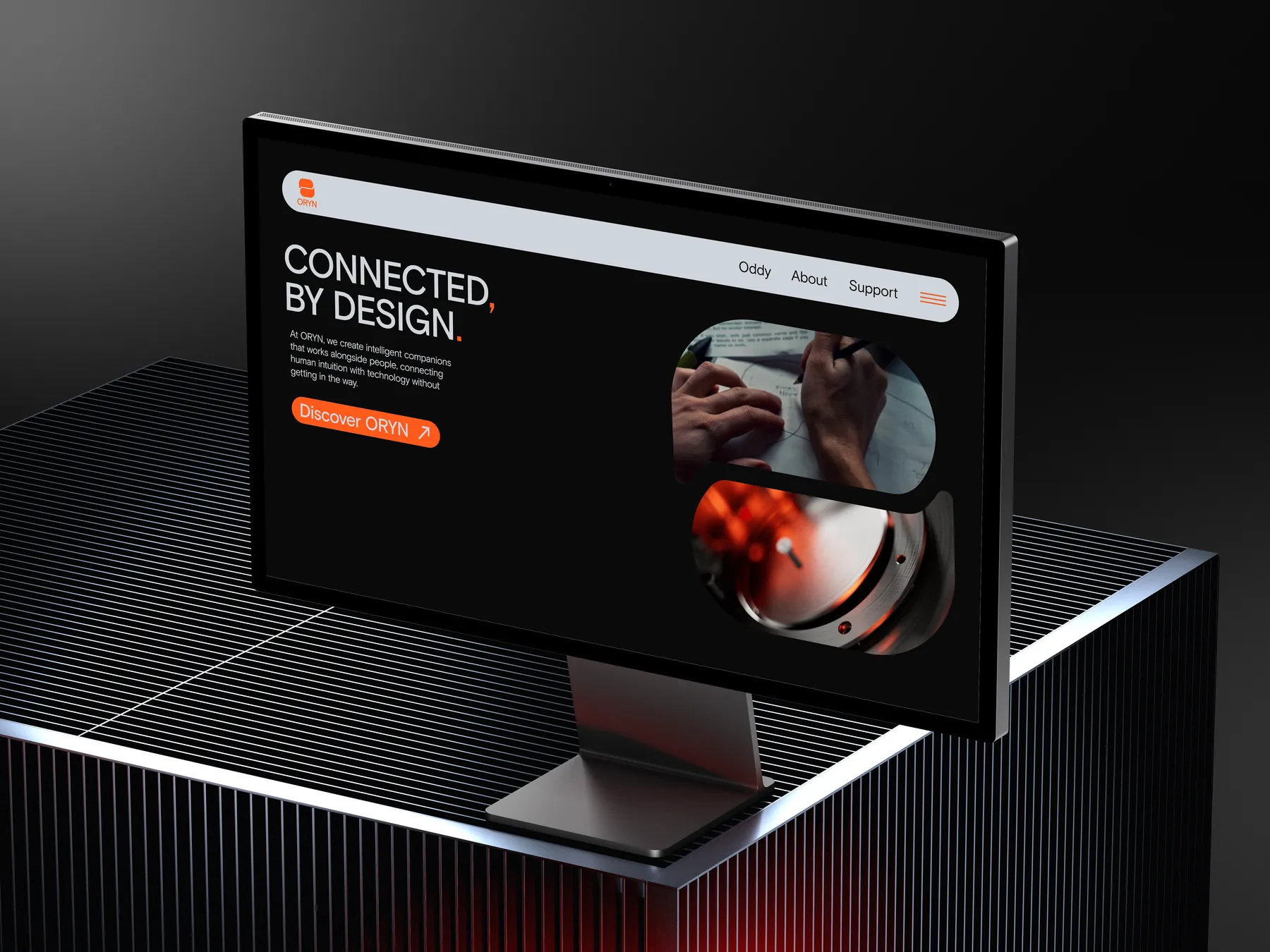
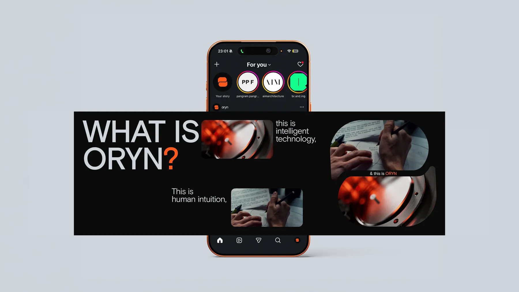
The system carries from a rooftop billboard and a bus shelter to a book, a keynote and a website.
A flexible identity for the word "bored".
* Conceptual work
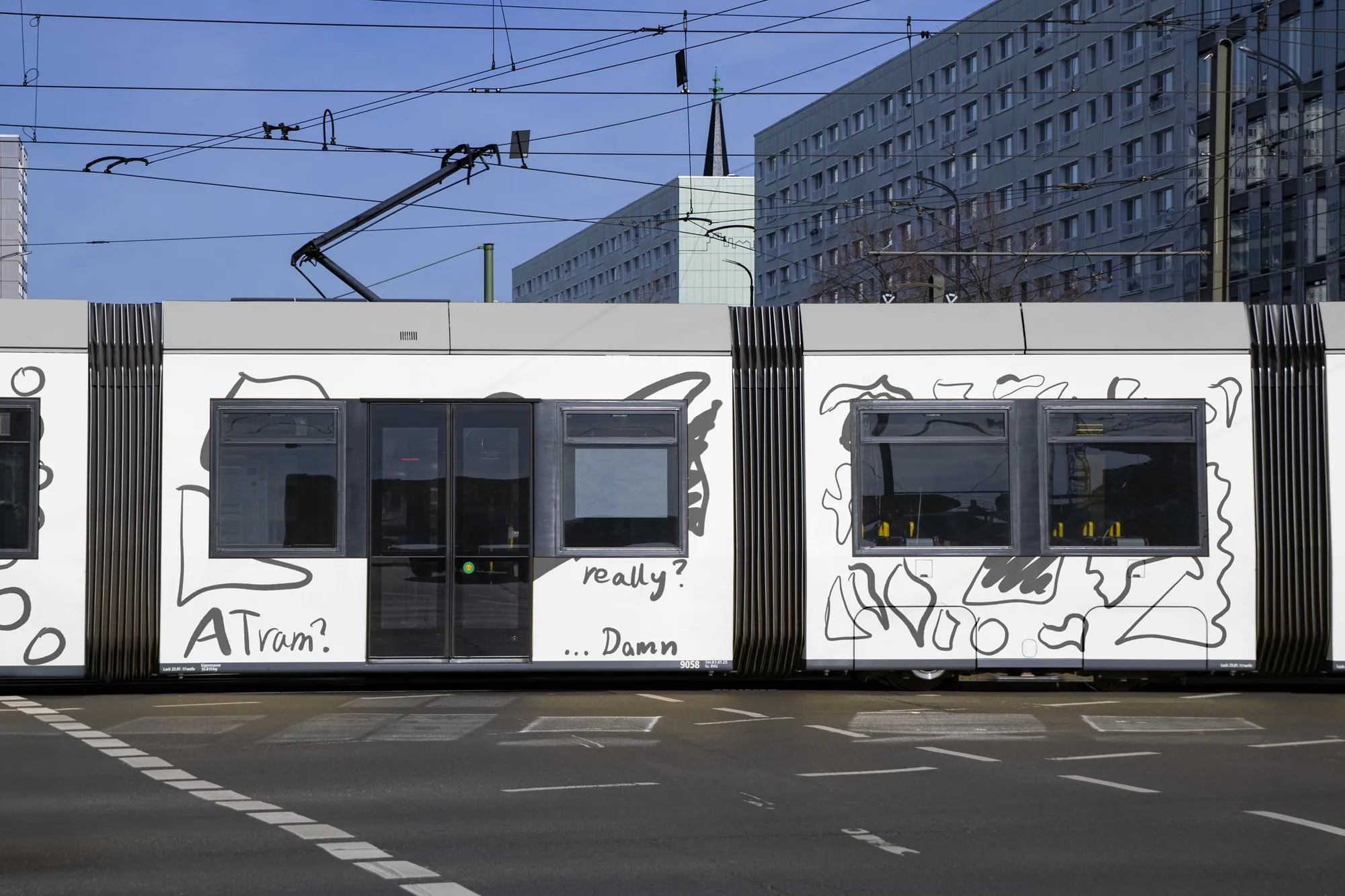
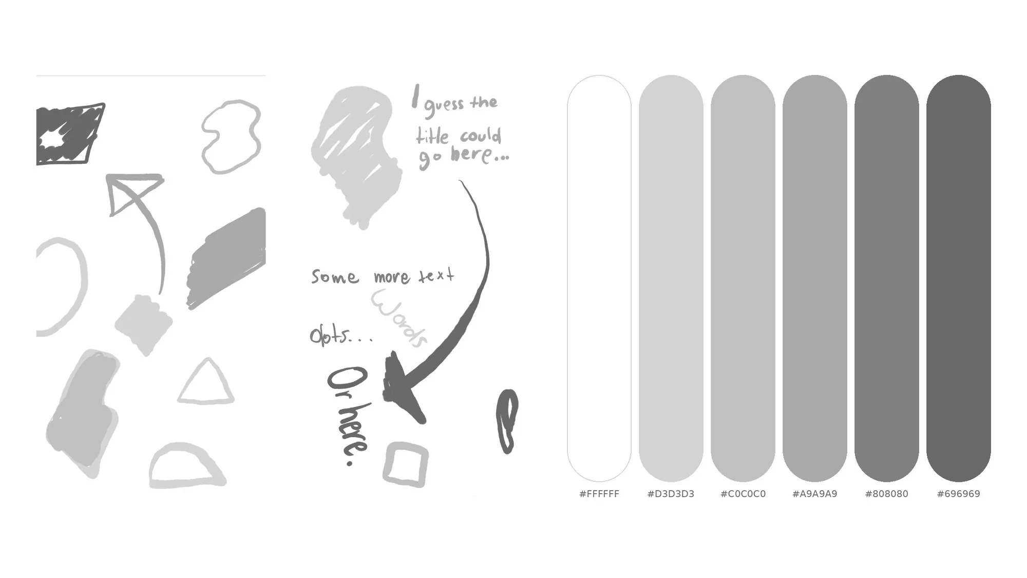
A school assignment: turn one keyword into a flexible visual identity, with no fixed logo. I chose "bored".
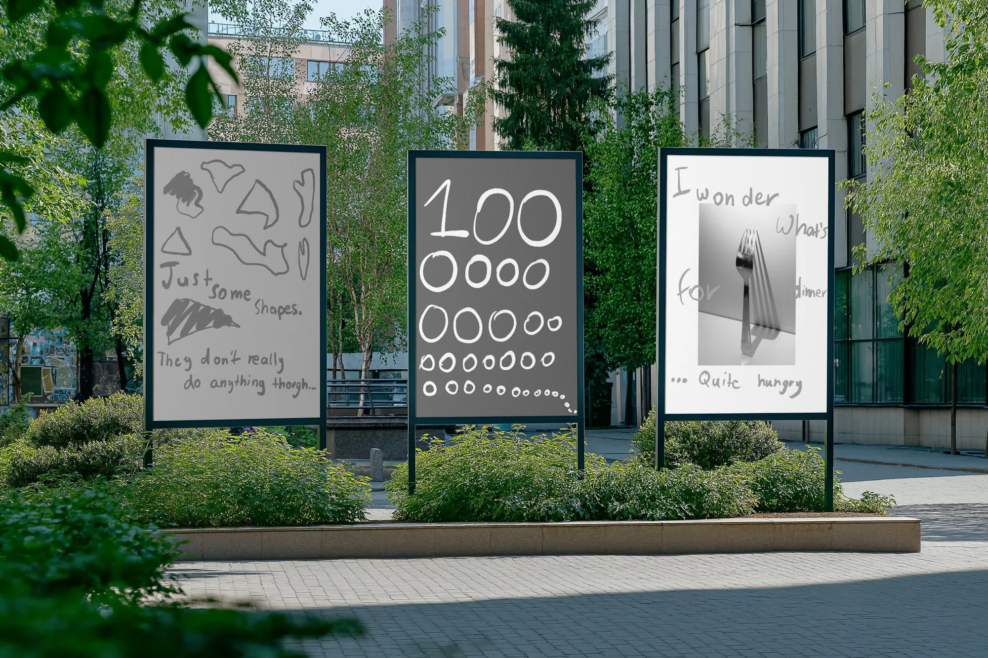
Bored means predictability, repetition and low stimulation, so the identity is intentional monotony. It stays recognisable through how it behaves, not through a logo.
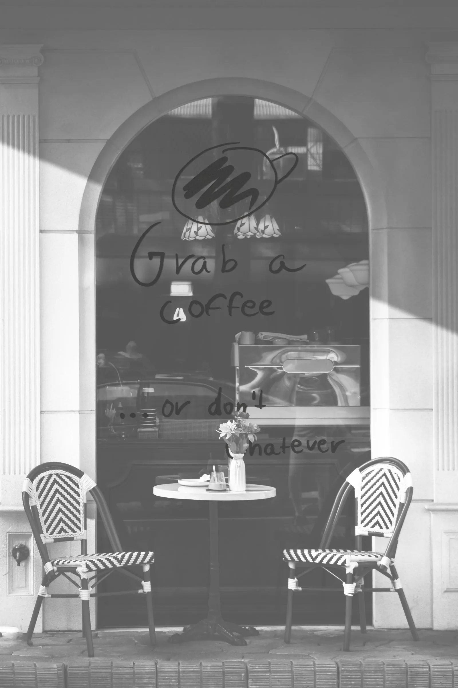
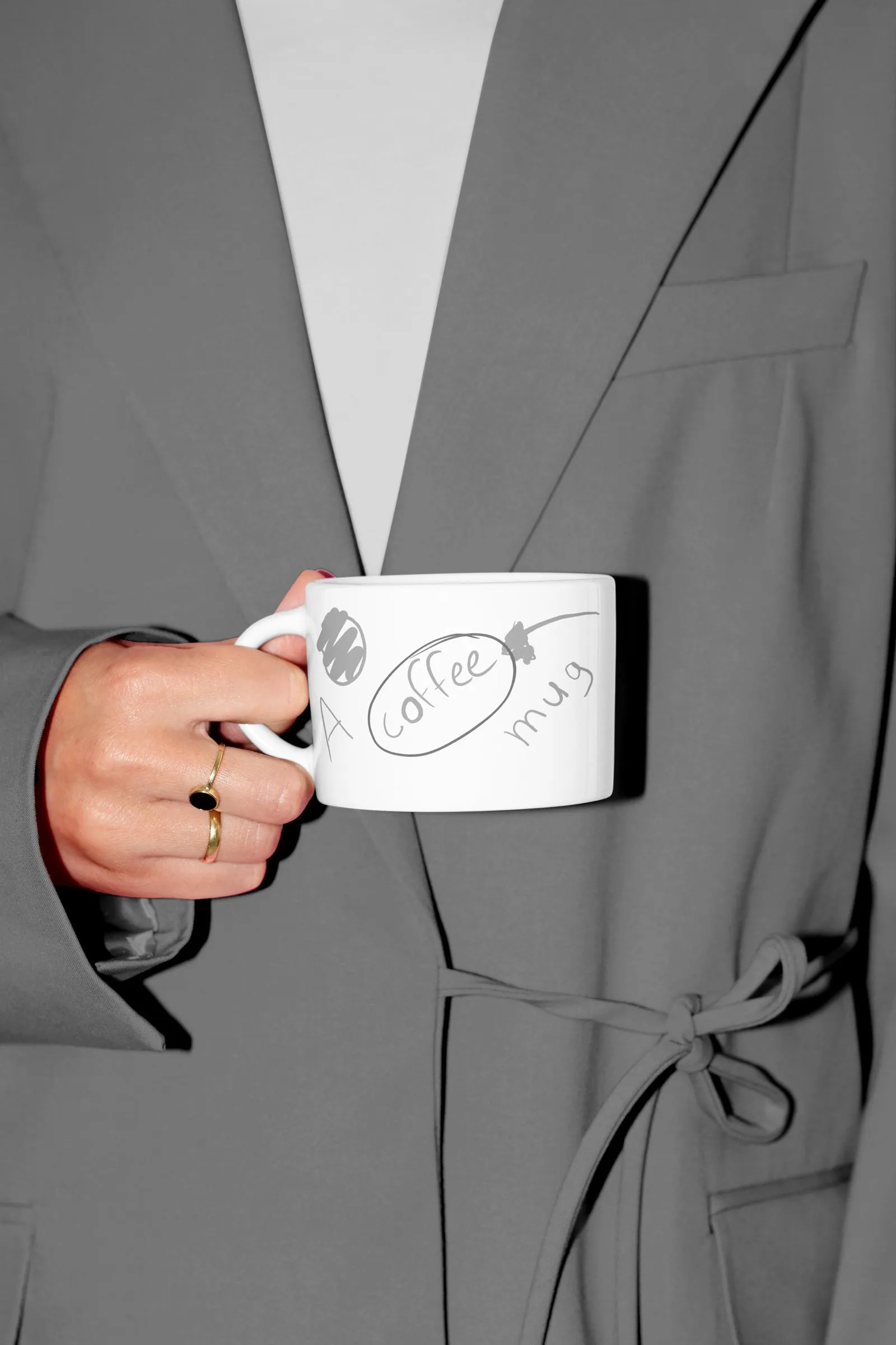
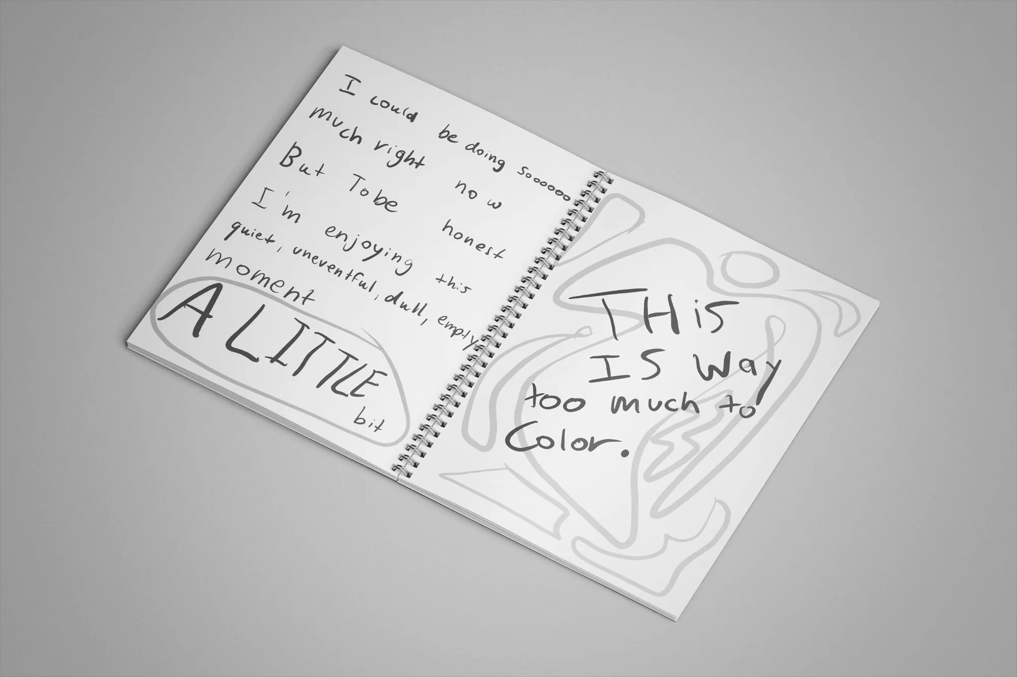
A restrained grey palette, hand-drawn letters, calm doodles, slow motion and deadpan copy. Every element behaves the same way, so the system flexes across formats without losing itself.
"My bike's in the bean."
* Conceptual work
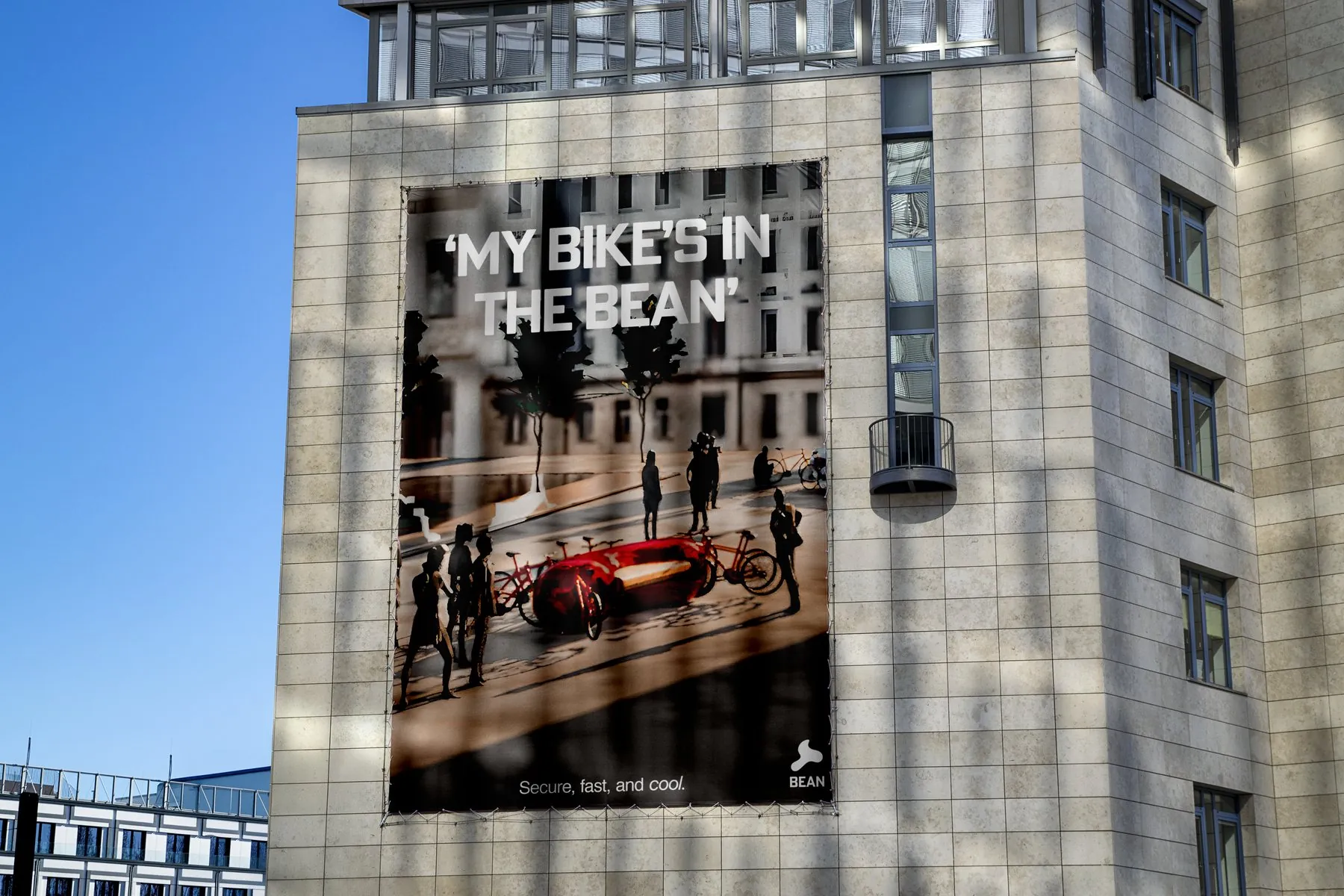
The assignment was about desire paths: find a place where people ignore the route that was designed for them, work out why their way works better, and design with it instead of against it. Mine is bike parking. Look at any busy building: bikes are leaned against it. The city does provide parking, but it is too small, too inconvenient and too far from where people actually go. People take the shortcut, so I designed for that.
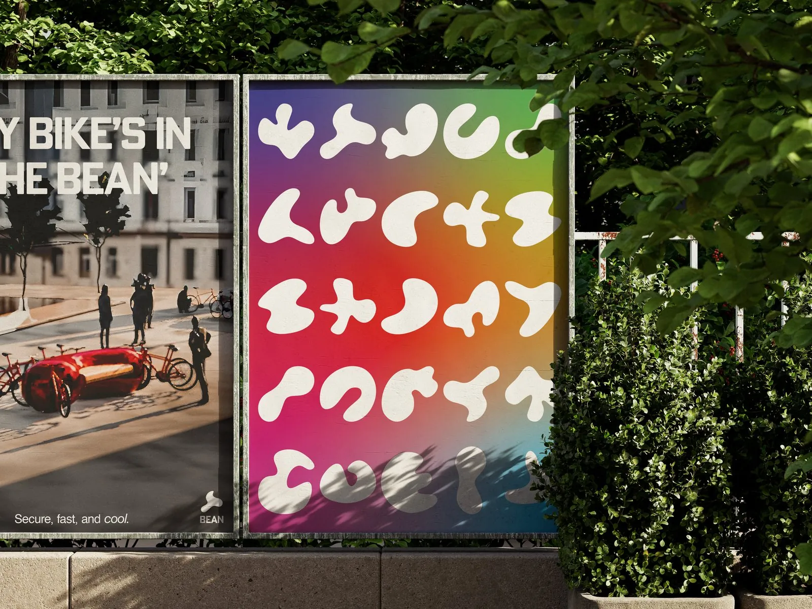
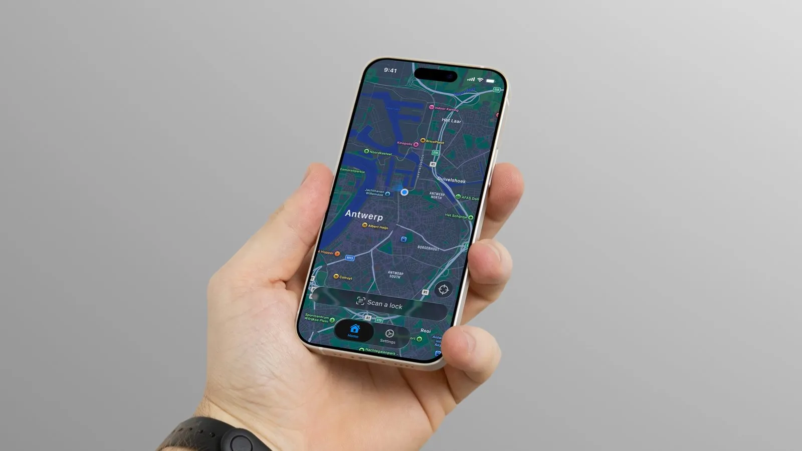
In the concept, Bean is a government-funded brand that turns bike parking into functional art. You roll your front wheel into the bean, scan the code in the app and a bar locks it. Every bean can differ in size, shape, colour and graphics, and artists and brands can make their own.
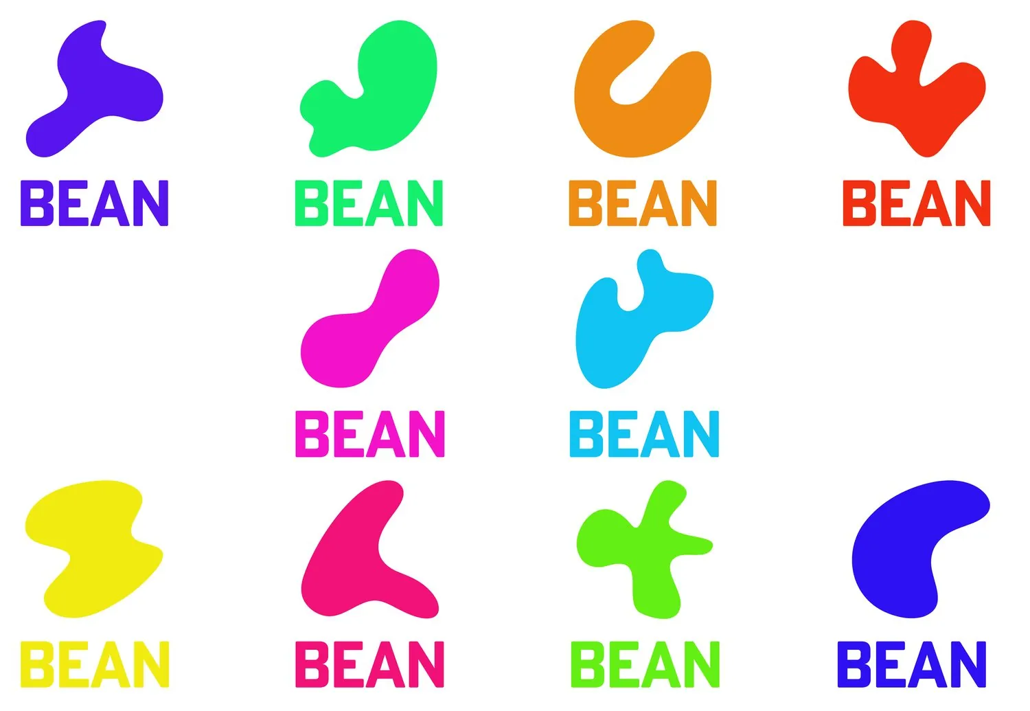
A dynamic logo made of one soft shape, always with a concave part and never a sharp corner, in a colour that can change every time. The product is a functional art piece, so the identity is allowed to move with it.
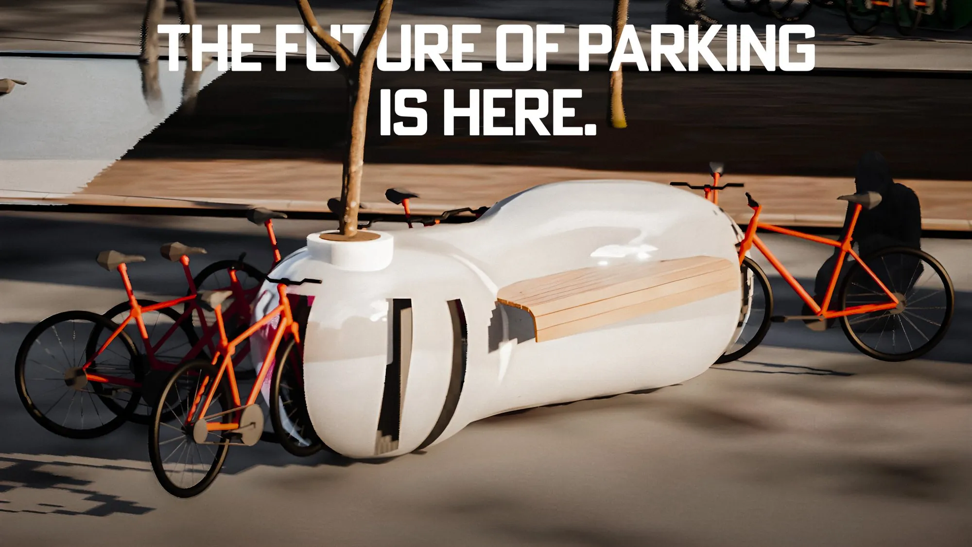
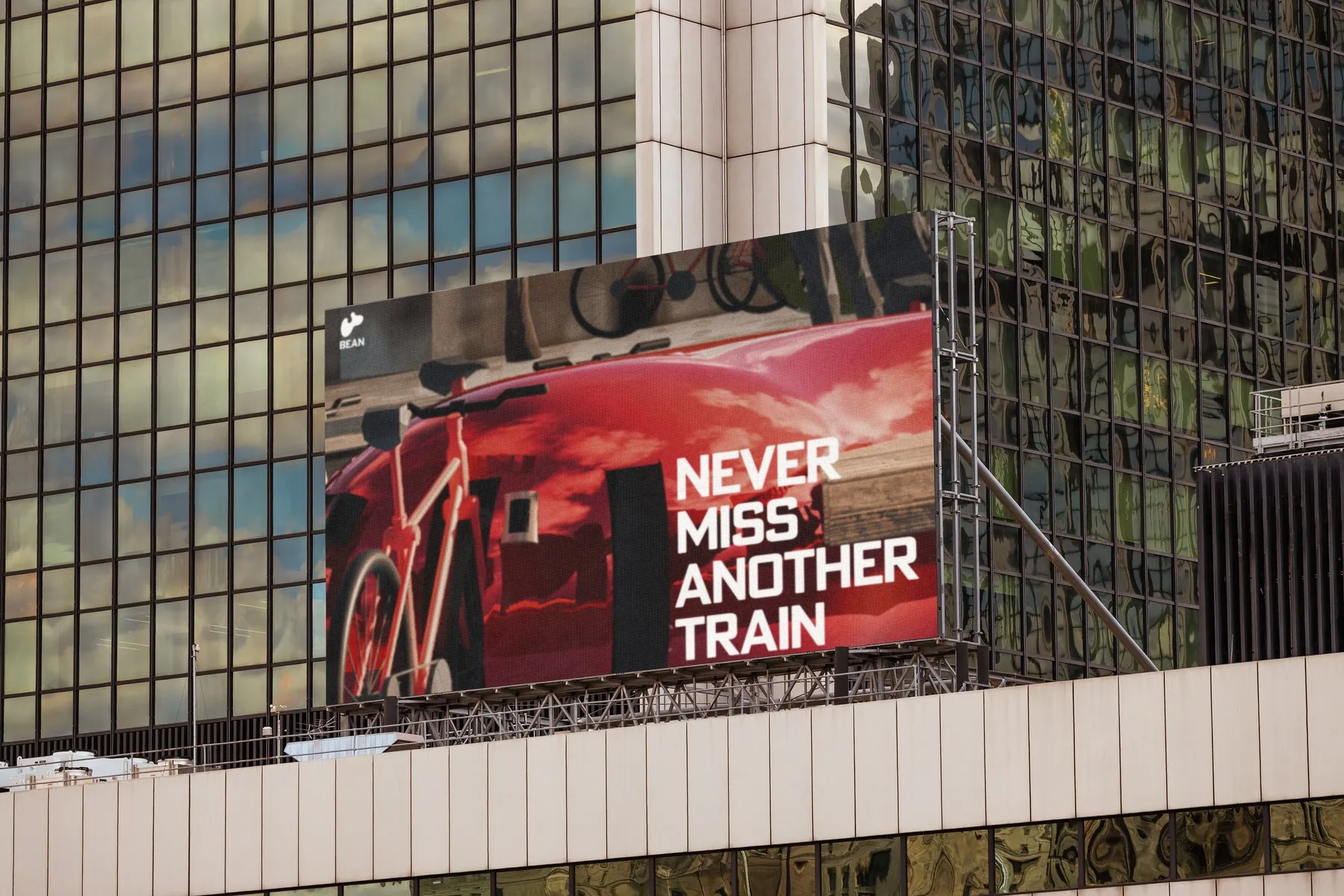
A two-week team project of four. I did the concept, the branding and the presentation. The 3D scene was built by a teammate.
A construction site you can shop.
* Conceptual work
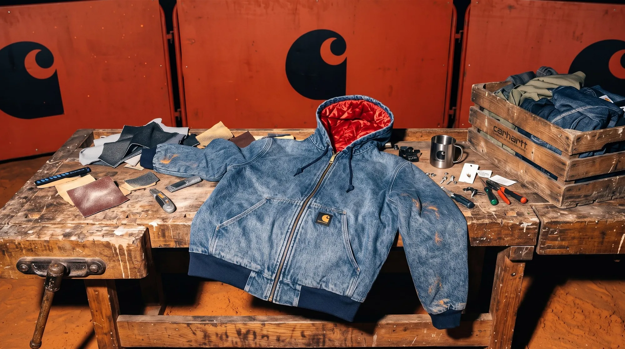
A school assignment: design a 360° pop-up that re-imagines how a brand connects with people in Antwerp. I chose Carhartt WIP, a brand with its roots in construction and workwear, and its Active Jacket, in the jacket's 50th anniversary year.
I started in the current Antwerp store. It is beautifully designed, but it puts too many subcultures under one roof: skate, music and brutalism all at once. Too many aesthetics, no single concept, and an atmosphere that stays cool and distant. So the pop-up commits to one idea.
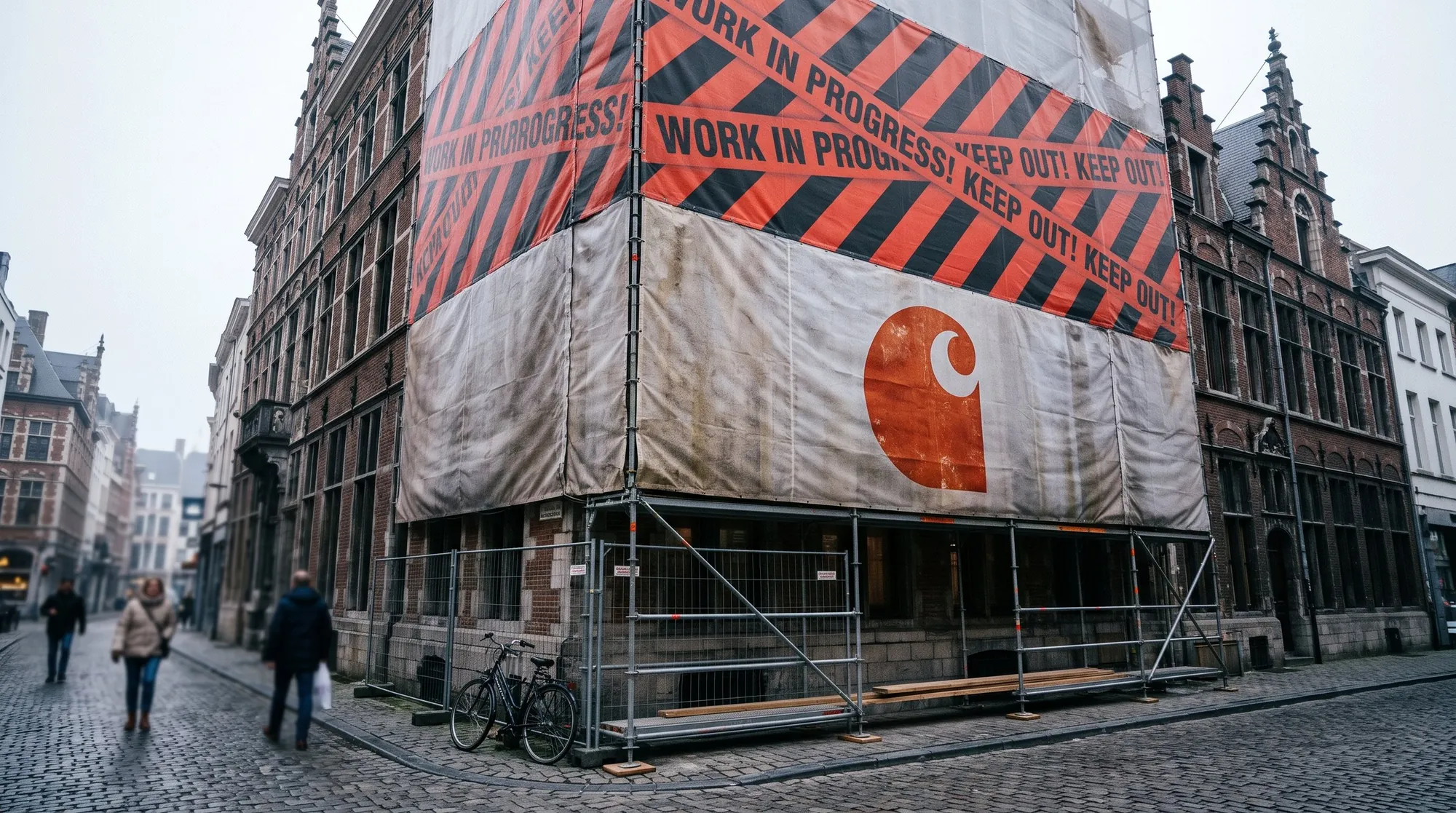
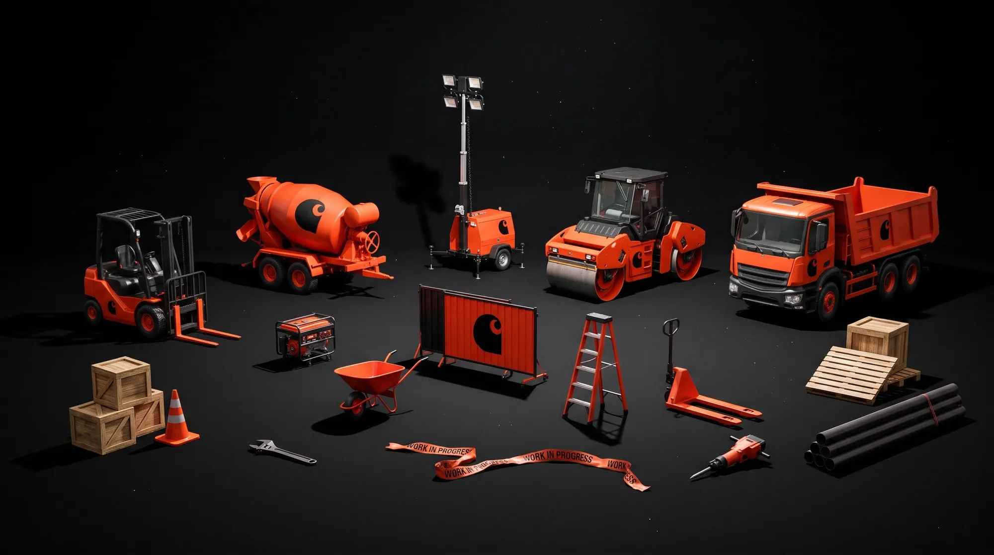
Antwerp is always under construction, so the pop-up is a construction site. Everyday site objects are WIP-ified in Carhartt black and Carhartt orange, and they become the displays, standing on a floor of orange sand.
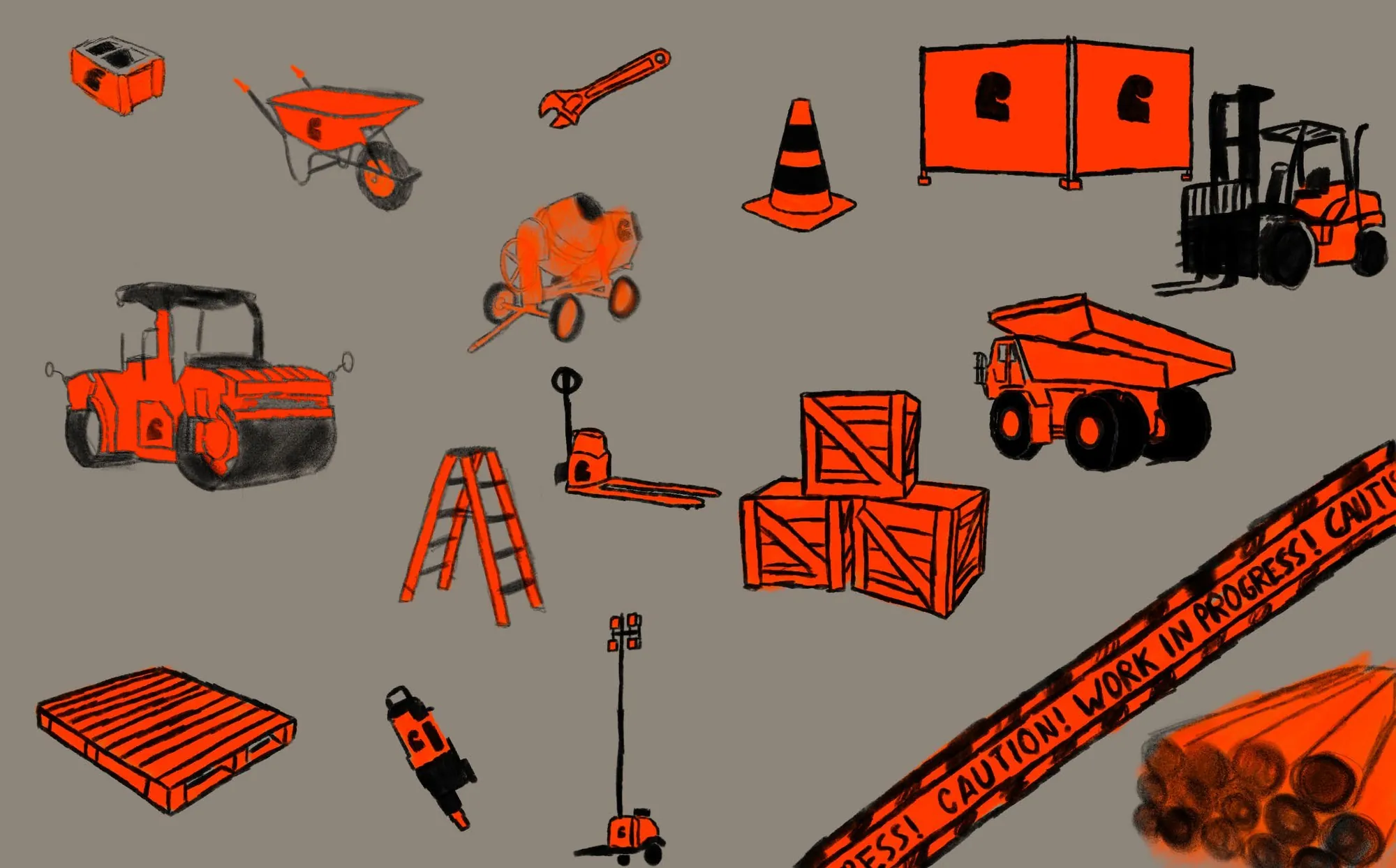
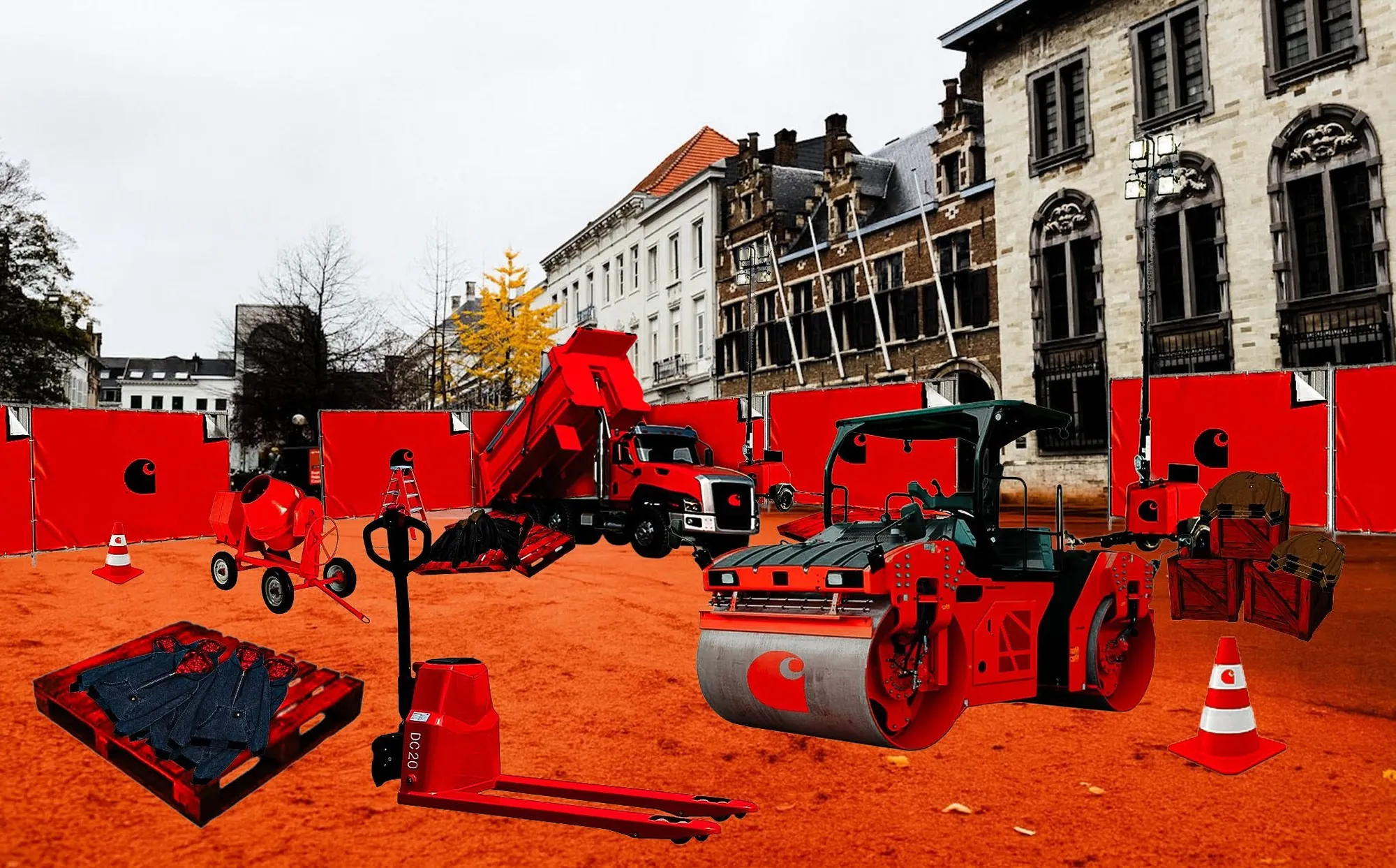
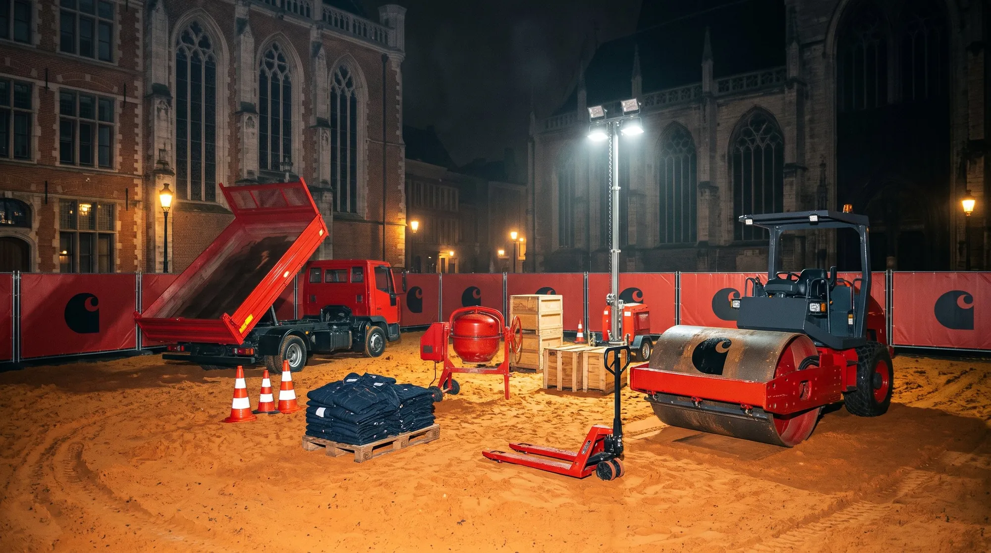
Carhartt black and Carhartt orange form the system. Cranes, crates, cones and machinery get the Carhartt WIP treatment.
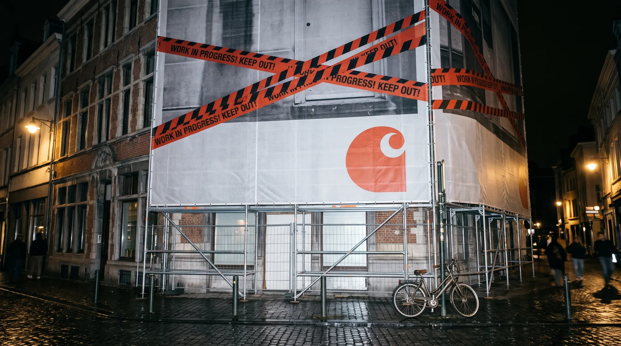
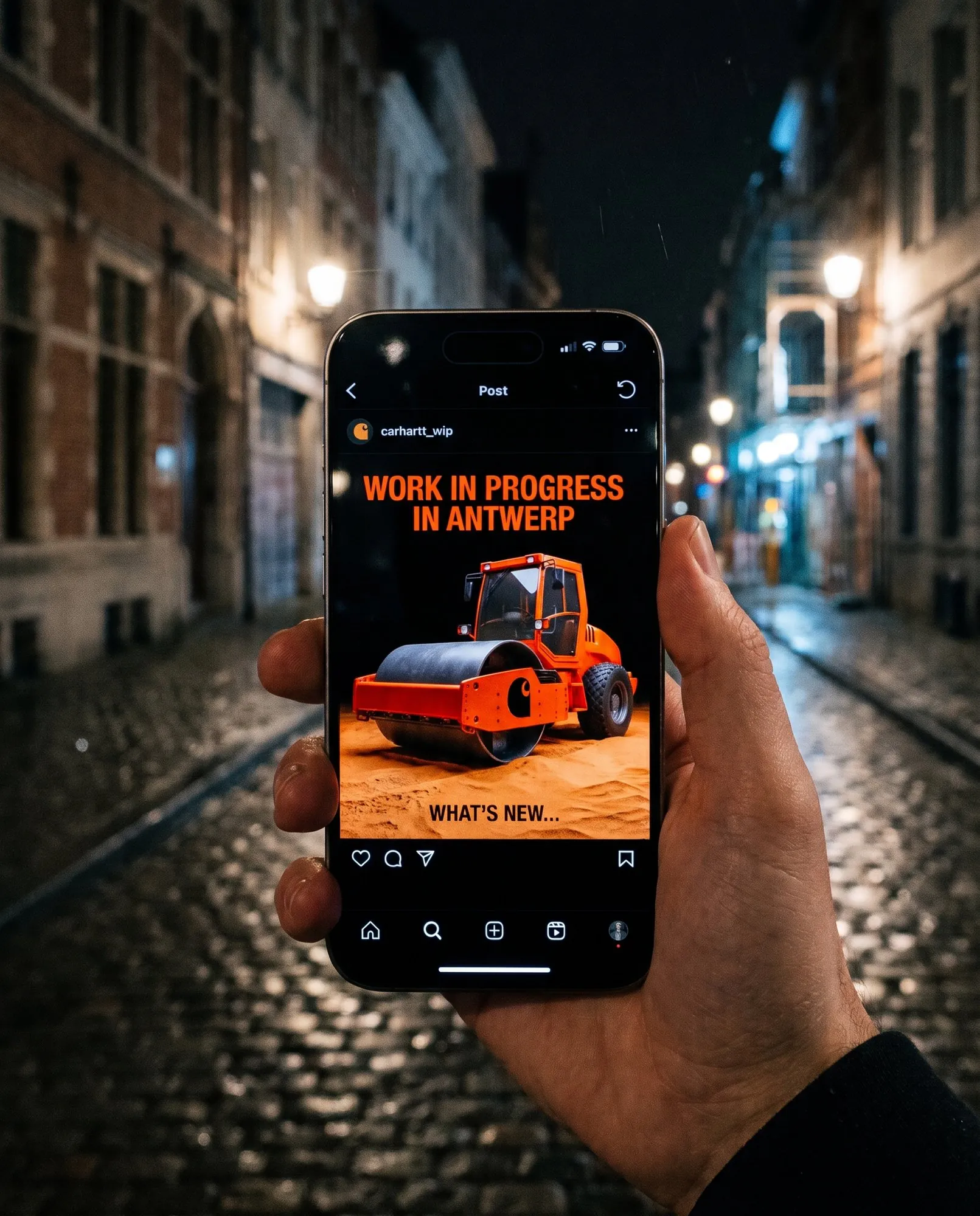
Banners across the city only hint, never explain. Teaser posts and mini-vlogs show fragments, and invited creatives spread the word before the doors open.
A rebrand of my own practice, studiolo.todaro.
* Conceptual work
A fictive campaign built around my POP ART Mixtape.
* Conceptual work
Sicilian core,
Big Apple mind.
I'm Juliano Todaro, a brand designer from Antwerp with Sicilian roots and a New York state of mind. I work as a junior brand designer at Donkeycomm and studied Graphic & Digital Media at AP Hogeschool, specializing in brand design. Next to the cases above and my professional work I keep creating in my free time: posters, characters, photography, identities, beats, songs, art,... always in a state of progress.